BYE Calendar
January 14, 2024
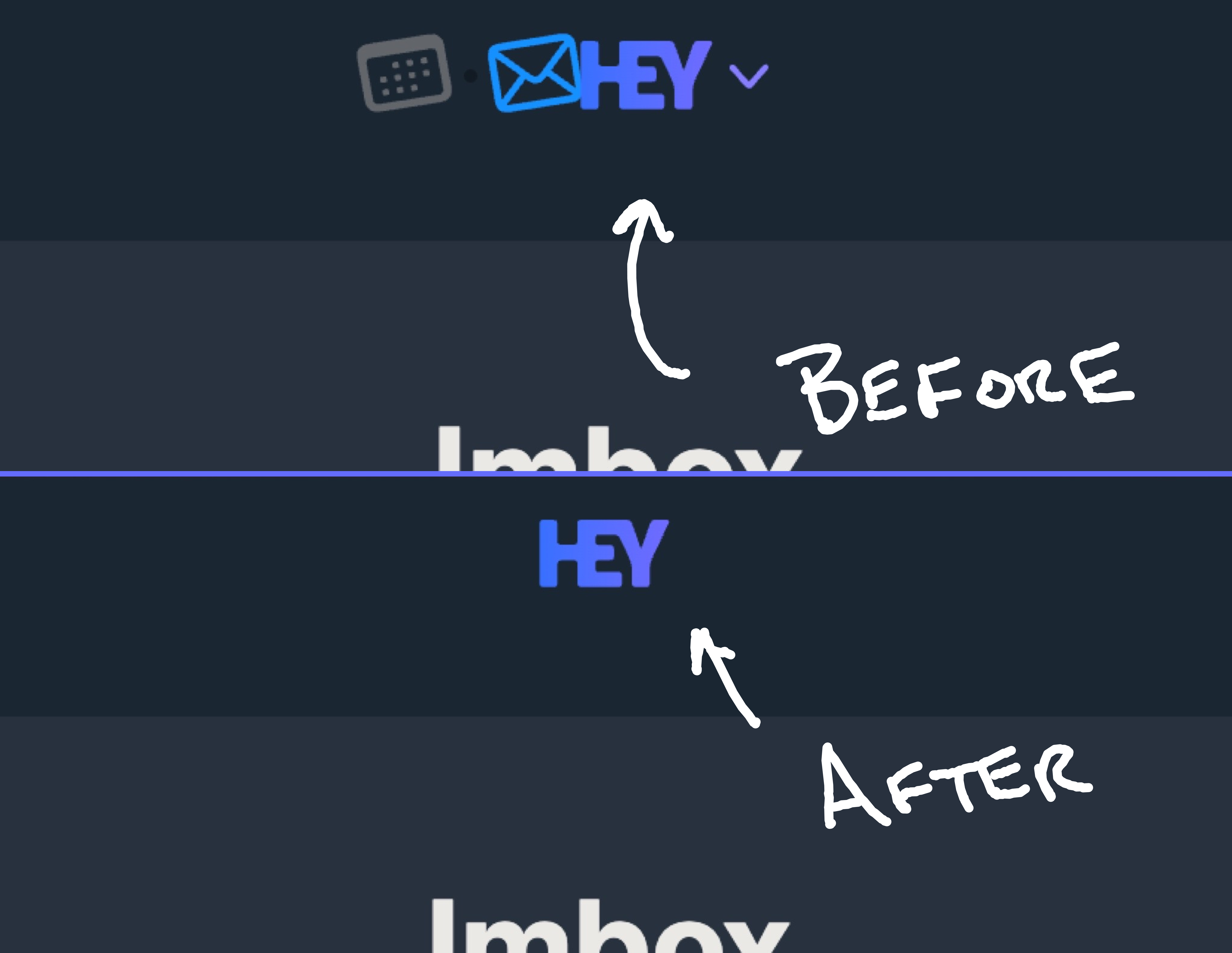
If you're a HEY user and find yourself disinterested in their new calendar, you may be sad to see its icon clogging up HEY's main header. Instead of a simple logo, it now houses a switcher that lets users jump between Email and Calendar.
I prefer the simpler, pre-Calendar header. So here's a few lines of CSS you can inject to sort of revert to the original.

If you're using Arc Browser, you can just access my premade Boost here.
And for those that would like to inject this CSS in other ways, here's what you need:
.navbar__logo-icons {
  display: none !important;
}

.navbar__logo::before {
  display: none !important;
}

.navbar__content > .u-relative {
  margin-left: -2rem !important;
}

.navbar__logo::after {
  display: none;
}
At first I wrote this CSS as a joke, but then I decided I actually prefer not to see a switcher I won't use. So I thought I'd share. Enjoy!
PS: If you're picking up on a salty tone here, you can read my open letter to HEY. I do still love the core service, but I have a number of serious, growing concerns.